Ladders Recruiter Homepage
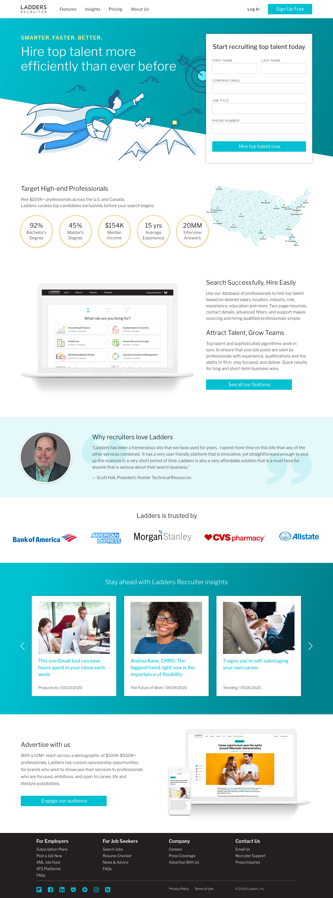
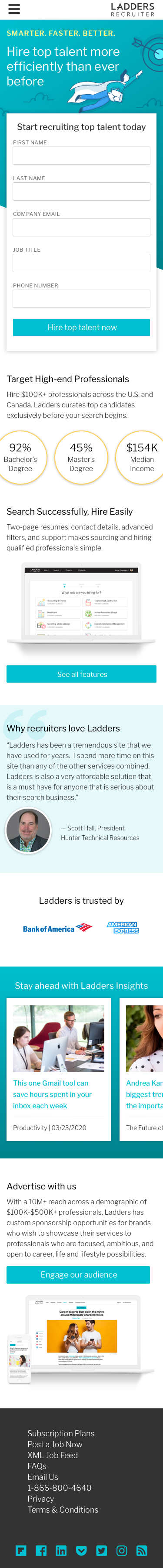
I chose to introduce a new, bright, modern look and feel to the site, while continuing the use of our primary brand color, teal. Yellow was introduced as a secondary color to draw attention to key details. I included an aspirational illustration in the style of our email graphics along with an asymmetrical gradient header to draw attention to the most important element: our sign up form! Some basic (but important) product information was added to build interest, along with a client testimonial and logos to built trust. Over 90% of our audience visits on a desktop, but I still design with the mobile user in mind using horizontal scroll to make content accessible.
Desktop
Mobile
Ladders Recruiter Features Page
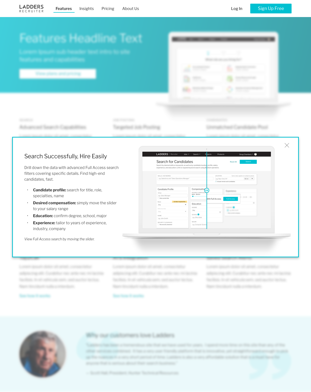
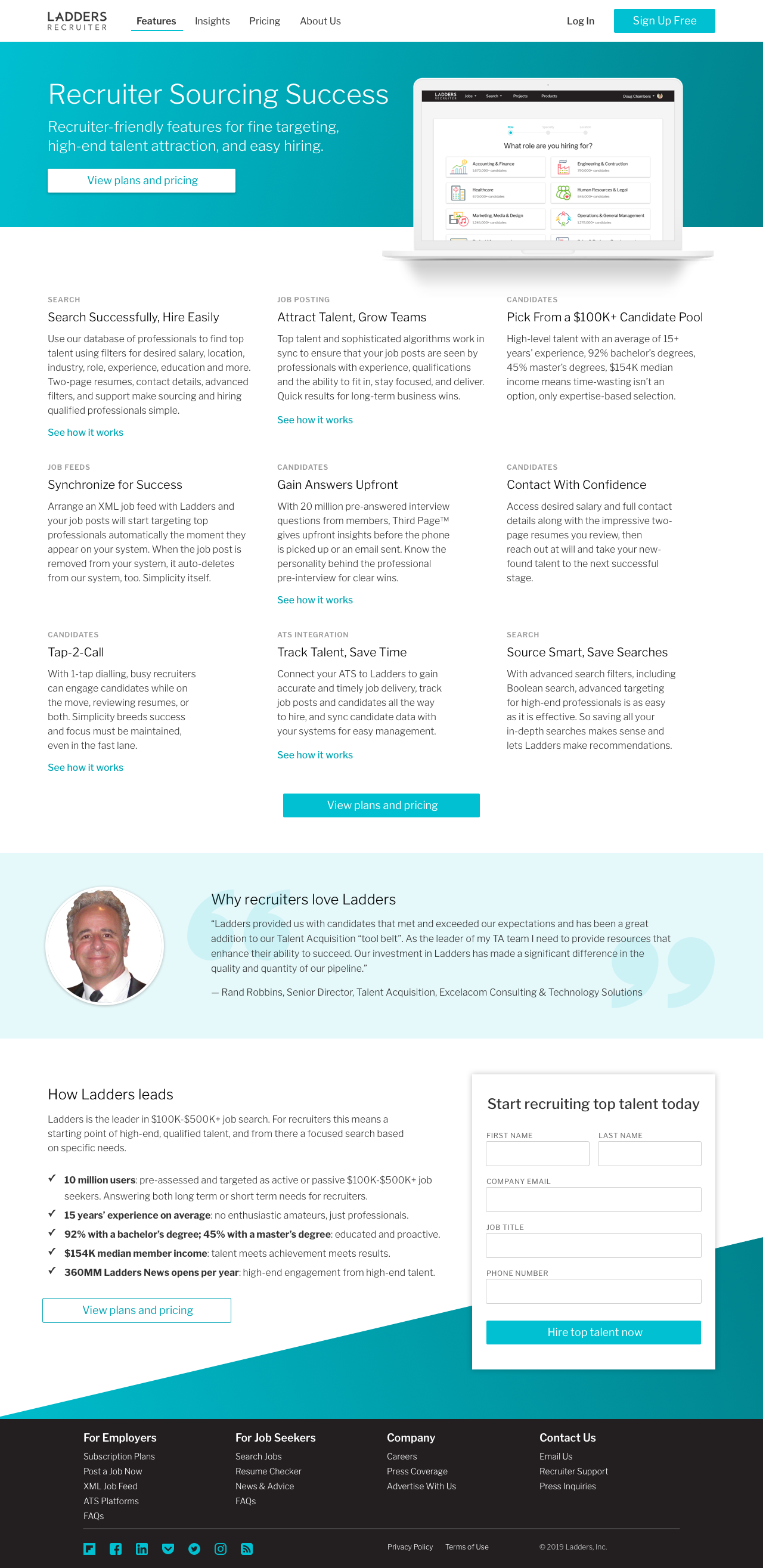
Our features page previously only highlighted 3 features, and there was so much more to share with potential clients that I felt needed to be shared! A clear CTA to the pricing page was added at the top and bottom of the page for easy access. Short descriptions were added for all features, with additional modals for a select few where more information and graphics could help paint a clearer picture. The search feature modal was designed to have slider functionality to toggle between the free and paid experiences to see how they differ.
Desktop Page
Search Feature Details Modal