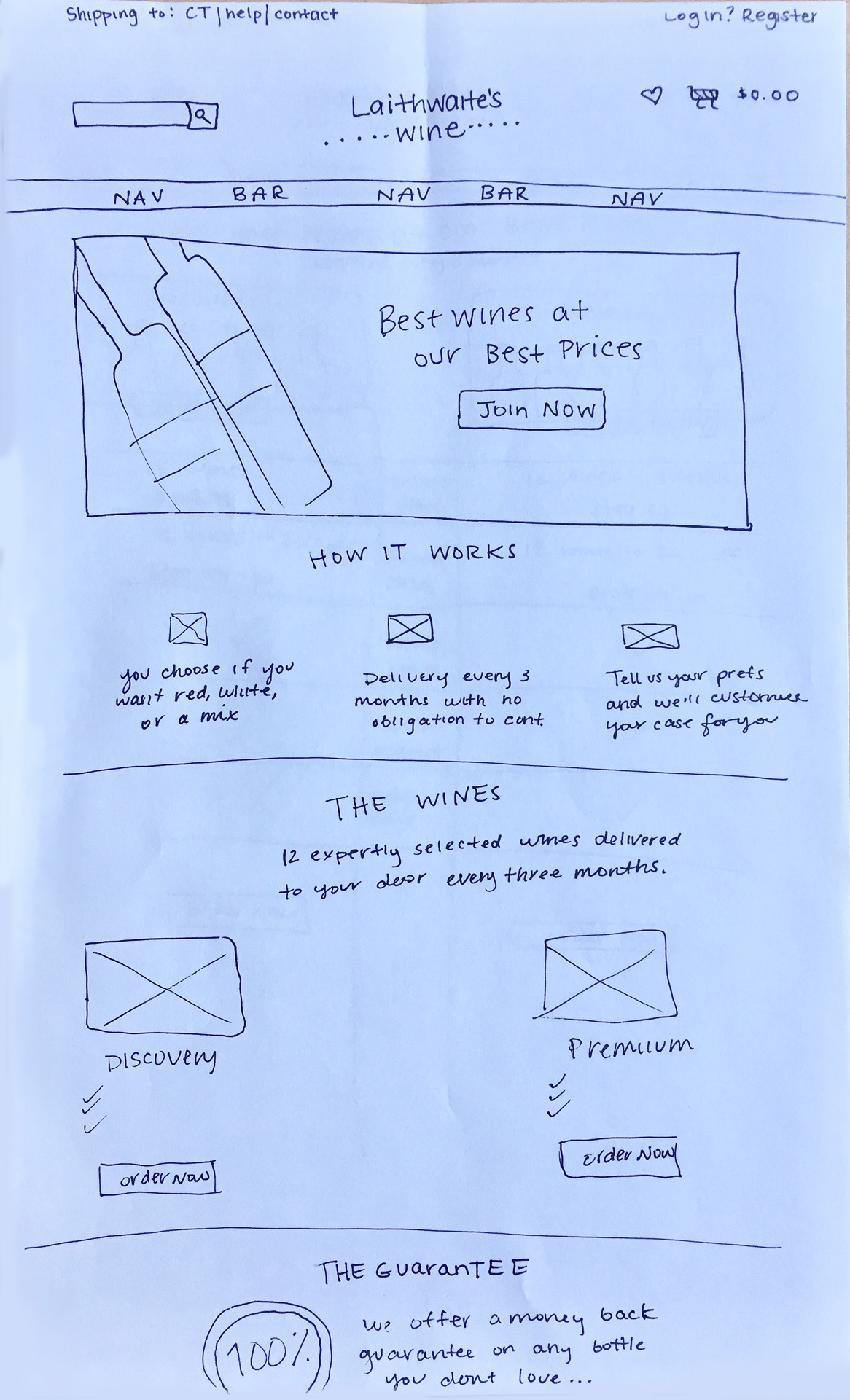
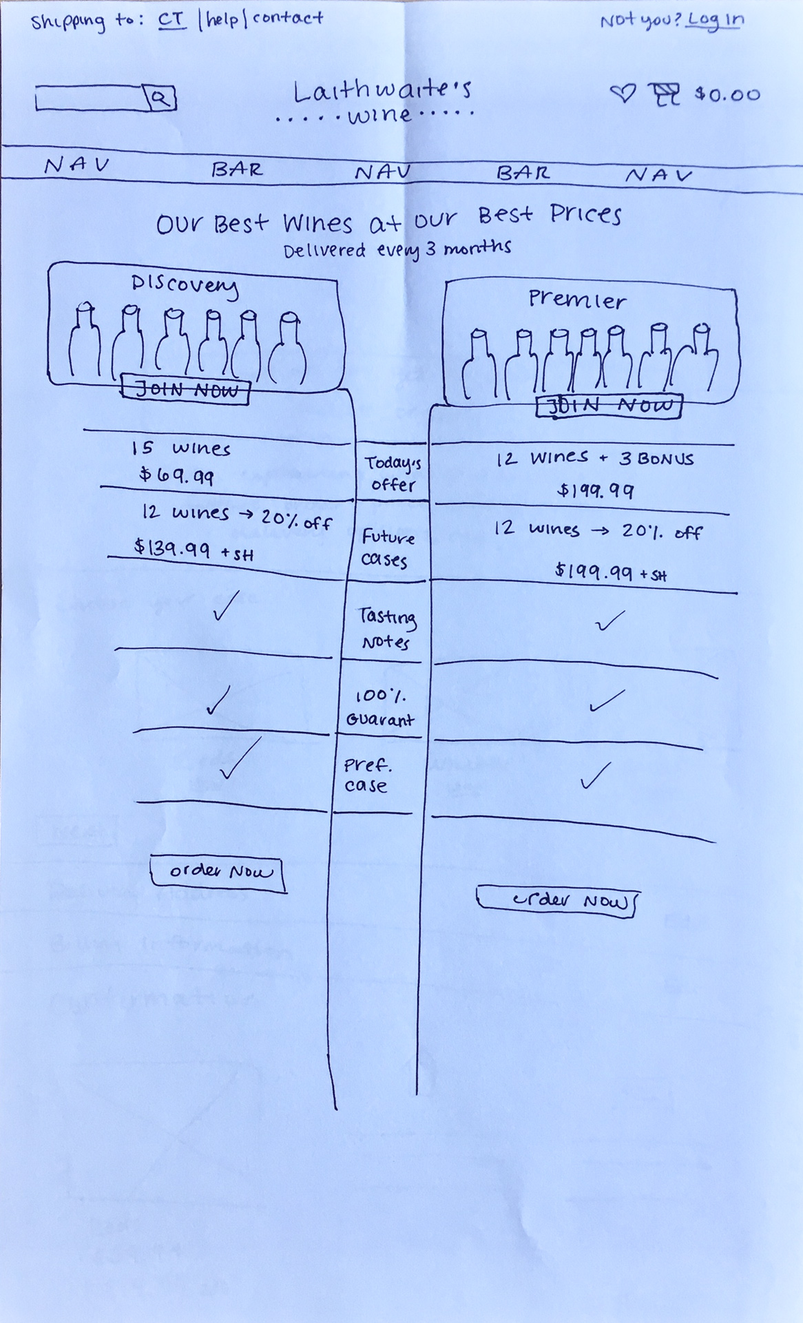
Wine Clubs

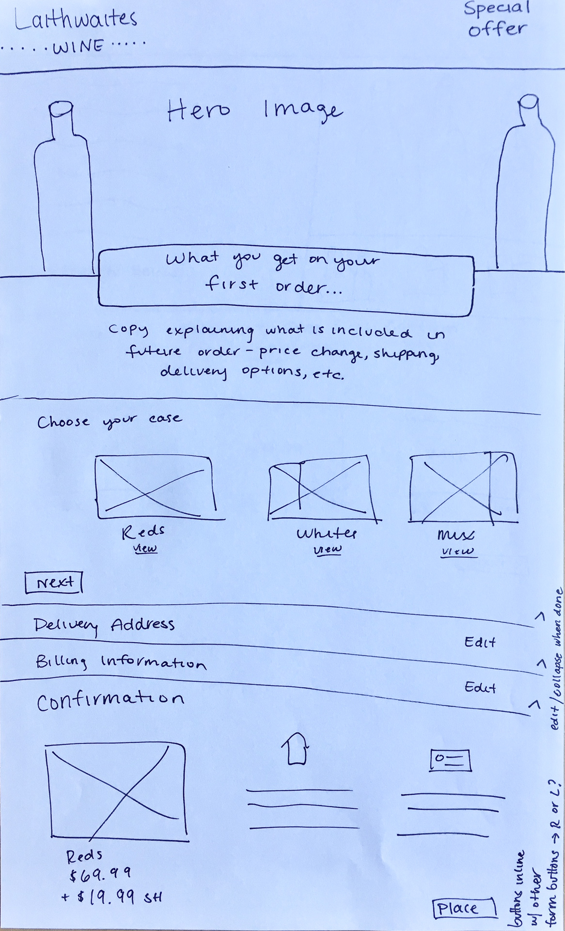
Laithewaite's Wine offers 2 different Wine Clubs to consumers as an option to recieve quarterly cases of wine tailored to their tastes at a great value. Currently, these 2 clubs are breifly introduced on the website here. Once a user chooses a club they're directed to an order form landing page like this one.

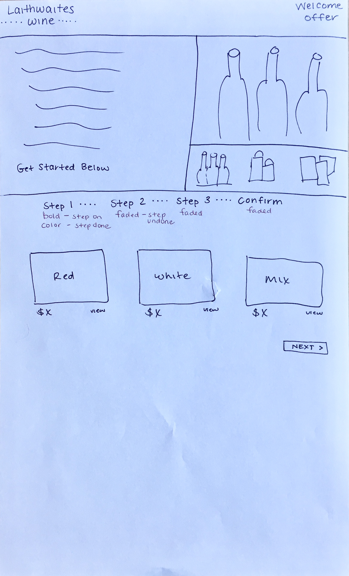
The problem: The order form pages do not make it obvious that the user is going to be joining a club and the club selection page does not display the differences between the 2 clubs clearly.

My role: Redesign the club selection page and order process to be more user friendly and clear to users that they are joining a club.

The date: January 2018


Goals

Once the problem was defined, I set goals to keep the user experience at the center of my design process.


Differentiate

Display the differences between the 2 clubs the user is able to choose from in a more visual way, rather than just blocks of text

Clarify

Make it clear the user will be joining a club with reoccurring delieveries, not just making a one time purchase

Streamline

Simplify the order form, reducing the amount of information requested at once to prevent overwhelming the user

Sketch

I created 2 sketches focusing on the club selection page and 2 for a checkout process, all ended up meshing together in the final design.


High-Fidelity Mocks

I ended up creating three designs: one for the club overview and selection page, one club page with an accordion style checkout, and another design that is for order checkout only.

Take a look at a video walk through of all three designs below!

Club Selection Page

The copy in the hero image is presented in check-mark bullets so the consumer can see a quick overview of the opportunity and feel confident the information is valid.

The "how it works" section is also able to be read quickly using icons and is in an over-lapping container to encourage scrolling.

The "guarantee" section features the 100% money back stamp in the center which will be prominent to users scanning the page, leaving them feeling confident.

Lastly, the two clubs are displayed side by side, presenting the differences visually so the user can easily compare their options and make a choice.


Club Page + Accordion Checkout

This page would be reached when a user selects a club to join.

Information for the chosen club would be displayed at the top, reminding the user of their choice and items that are included in today's order. There is also mention about future orders, once again reminding the user they are signing up for a club with reoccurring deliveries.

The accordion style checkout presents only one step at a time so the consumer is not overwhelmed with a long form, but is still able to see all the necessary steps. Each step can also be returned to during the order process.

I imagine the fields in this process to have floating labels to prevent elongating the form, in addition to auto fill for addresses or any saved information for ease of check-out.

Takeaways

This was a fun project to work on and present to my colleagues at Direct Wines. I was able to create designs unlike anything on the current site and explain my reasoning, challenging myself to translate my design decisions to people outside of the design team.